02/09/2022
For those that don’t already know, I recently won a D&AD pencil at this year’s New Blood awards; while everyone in DC creative is probably tired of me banging on about it, I’ve decided to ignore that completely and bang on some more about my winning entry! I wanted to share some of my thinking behind the project; where the idea came from and how I developed the concept.
First off, the brief. Every year, D&AD partners with a bunch of big brands to set the New Blood briefs – I chose the one set by Penguin Books. The challenge was to come up with a way for Penguin to make books and reading an unmissable part of pop culture.
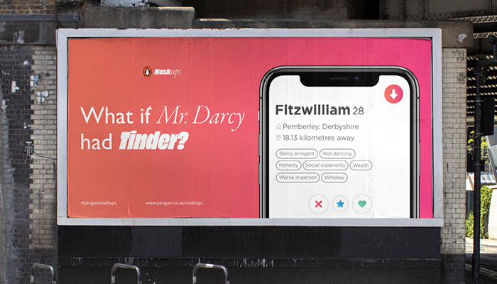
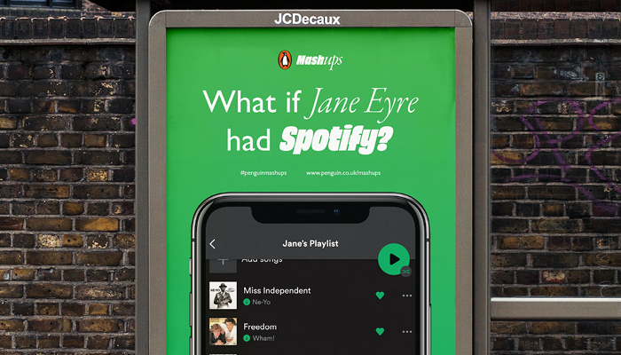
After examining the brief, a couple of things stood out to me in particular: the brief spoke about wanting to make books a ‘water cooler moment’ – something that is actively talked about amongst the wider public. It also mentioned the idea of ‘intersectionality’, where seemingly different worlds within the media collide (Greggs x Playstation comes to mind). Considering these two points together, I got thinking about how books might ‘collide’ with aspects of popular culture – could Penguin leverage current pop culture in some way to place books the centre of mainstream cultural conversation?
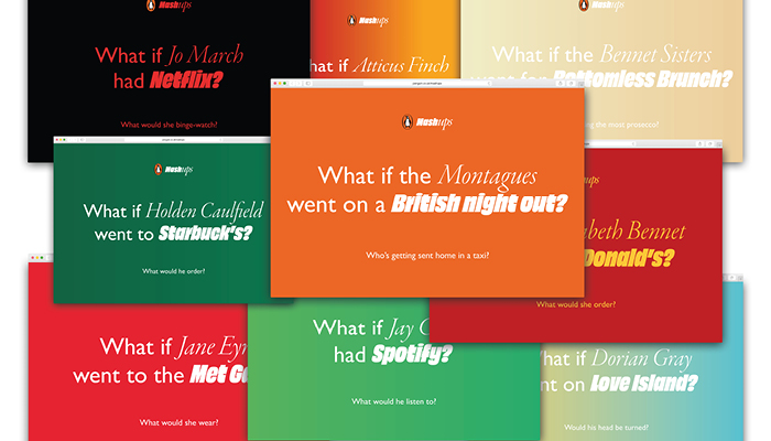
Expanding on this idea of ‘collision’, I looked into the world of ‘remix culture’ which describes the act of combining and editing existing materials to produce a new creative work. This quickly led me onto the idea of the mashup challenges: remixing book content with popular culture would not only produce a fresh perspective on the books and breathe new life into them, but by encouraging people to relate book content to different aspects of their day-to-day lives, the mashup challenges could show that books are still highly relevant in today’s society and therefore reposition books and reading as fundamental parts of pop culture.
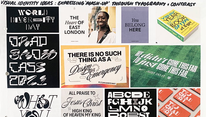
The campaign was initially called ‘Penguin Remixes’, though I later decided that ‘remixes’ felt too connected to music and so changed it to ‘Penguin Mashups’ instead. While this does, at first, sound like an unfortunate Antarctic accident, the name suited the disruptive and playful nature of the campaign. Core concept and name locked in, the art direction for the campaign followed quite naturally. I used a typographic approach to visually express the idea of a ‘mashup’, juxtaposing the two elements of the mashup challenges through contrasting type styles: a light script font for the classic book character and a blocky sans-serif for the cultural context.
The project was awarded a Graphite Pencil, meaning that it hit the three judging criteria – a good idea, well executed, and relevant to the brief. And I’m flippin’ over the moon.